
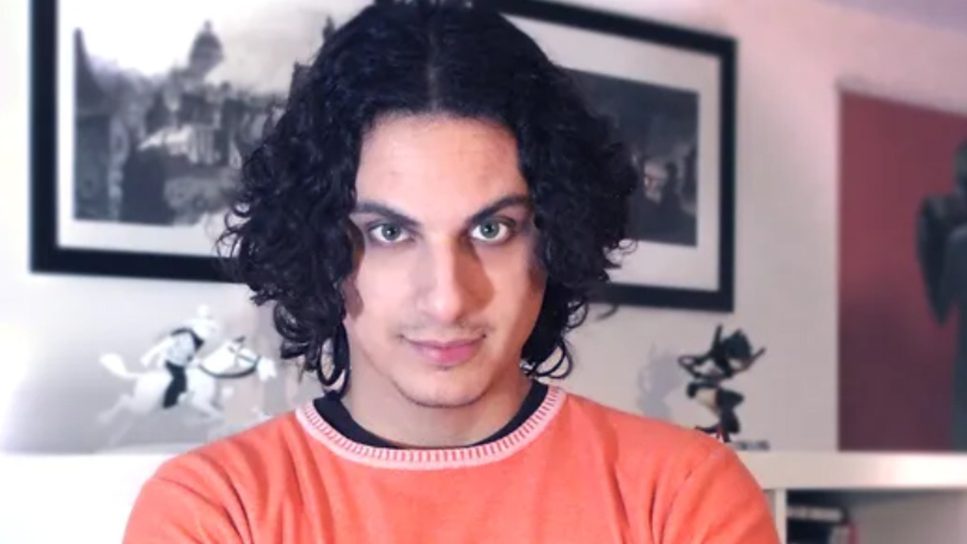
Spotlight: Flaviano Armentaro, the artist behind BOOM! Studios’ Grim
Written by Rossano D’Angelo
In 2022, BOOM! Studios kicked off Grim, a 25-issue dark and supernatural series that recently came to an end (in November 2025) after three years of interesting adventures set in the afterlife.
Written by Stephanie Phillips and illustrated by Italian artist Flaviano Armentaro with colours by Rico Renzi, the series quickly became one of the standout titles in BOOM! Studios’ catalogue.
Born in Salento (Puglia), Armentaro graduated in sculpting from the Brera Academy in Milan. Realising early on that this was not his calling and determined to move forward as a creator, he joined an animation studio in Turin as an apprentice animator. After two years, he began working as a freelance animator, but with the Italian market struggling and a growing passion for storyboarding, he gradually shifted his focus toward comics. Together with Italian cartoonist Marco Dambrosio and Mauro Biani, he launched the online comics blog Coreingrapho, marking his first real experience drawing comics.
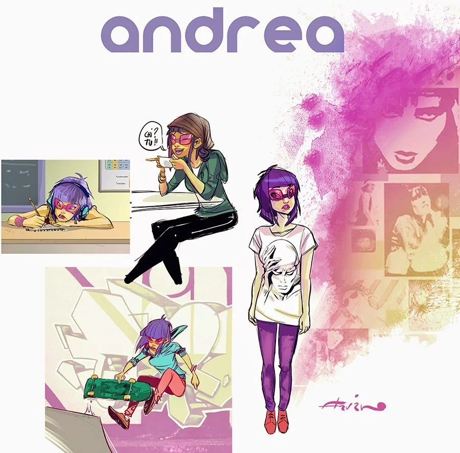
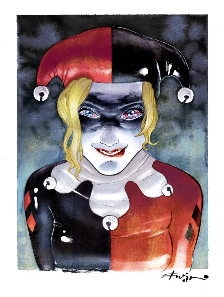
This proved to be a decisive step, paving the way for his international debut when DC Comics commissioned him to work on Harley Quinn. That first international experience helped him build a strong portfolio, which soon caught the attention of Marvel Comics and BOOM! Studios, where he was later offered the role of penciller on Grim.
Rossano D’Angelo: I know you’re working on Grim with Stephanie Phillips. Could you walk me through your creative process? Do you typically work from a detailed script, or do you have freedom to make your own choices about the characters, their appearance, and the environments we see in the story - for example, your depictions of Las Vegas and the afterlife?
Flaviano Armentaro: Working with Stephanie is fantastic because she’s genuinely collaborative. She doesn’t just do her thing and then inform you afterward - she involves you from the very beginning. Early on, she asked me what kind of script I preferred: something very open, or something more rigid. We eventually agreed on a middle ground.
The idea is simple: she writes her script, and as we move forward, if there’s something that doesn’t allow me to work comfortably, I tell her. If there’s something I feel the need to change, I change it. In fact, she was the one who encouraged me to speak up - she told me that if I ever saw something that didn’t convince me, we could either change it together or I could directly reinterpret it myself.
Overall, her scripts are very classic and clear in structure: descriptions, dialogue, descriptions, dialogue - which works perfectly for me. From time to time, she also adds notes or visual references in the script. For example, if a sequence is set in a specific location, she might include a photo to give me a sense of the mood. If that reference works for me, I use it; if it doesn’t, I look for my own references or build my own visual solution.
Even when it comes to more complex sequences - double-page splashes or particularly challenging scenes - she’s always extremely considerate. She usually writes to me saying, “I’ll describe it this way, but if you don’t like it, feel free to do it your way or find your own key to the scene.”
Because of this approach, working together feels incredibly smooth. We influence each other constantly: I influence her, she influences me, and we build the story together. There are times when I change something visually and she then rewrites the dialogue to better match what I’ve done. In other cases, changes I made in one issue gave her input that directly influenced how she approached the script for the following issue.
The aesthetic of Grim is very distinctive: dark but also elegant. What were your main sources of inspiration in creating this visual world?
This was very much a work in progress. When we started the series, both Stephanie and I imagined Grim as something darker and more somber - not straight horror, but more esoteric in tone. The themes were always there, and if you look at the early issues you can really see that approach: there’s a lot of black, the linework is more detailed, and the overall atmosphere is heavier.
In the first issue, for example, there’s the scene at the river of souls, where I almost drew each soul emerging from the water one by one. For that, I was following a reference Stephanie had provided: an engraving by Gustave Doré. She wanted to evoke that particular vision of Hell found in Doré’s illustrations, which is also why my line was thinner and more intricate in those early pages. Obviously, my style is very different and I would never claim to be anywhere near that level, but I tried to capture a similar feeling.
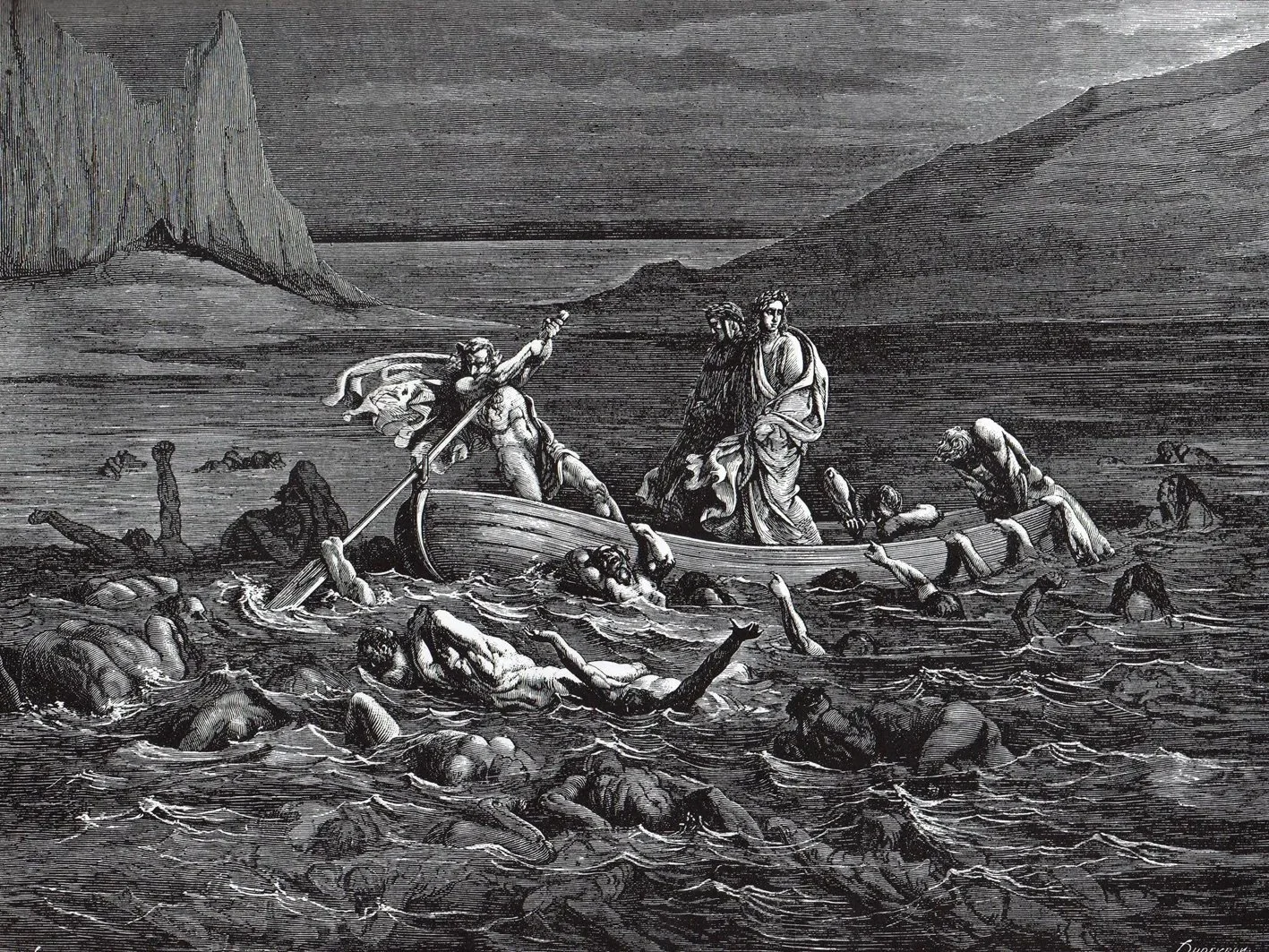
Hell by Gustave Doré
As the series went on, however, both the story and the visuals began to change. As Stephanie developed the narrative and I continued drawing, Grim gradually shifted from an esoteric, horror-leaning story into something much more personal - a coming-of-age journey centered on this young woman searching for her family, her origins, and her place in the world. Over time, new characters appear: first the father, then the mother, and then others, until a kind of chosen family is built along the way. That evolution really resonated with me.
I was more than happy to give up the opportunity to constantly push for extreme horror or shocking imagery in favor of telling a story about growth and connection. I grew up with stories like Dragon Ball, where the protagonist’s journey is defined by the people they meet and the family that forms over time, and that influence is definitely there. As the story became more intimate, my art evolved with it: the visuals grew less dark, less detailed, and more focused on close-ups, dialogue, and creating a warmer, more familiar atmosphere - especially in scenes involving the father.
I think anyone who’s read the series can feel that shift. Grim changes quite dramatically from the beginning to the end, both narratively and visually, and that evolution was very much intentional.
As for the use of color, that actually wasn’t a deliberate stylistic stylistic decision. Rico, the colorist, and I had already worked together on King in Black: Gwenom vs. Carnage and we had essentially used the same color palette there because I really liked how it turned out. The setting in those books was also quite dark, so I suggested to Rico that, since it had worked once, we could reuse that palette for Grim as well.
Over the course of the series, though, Rico began experimenting more, introducing new solutions and slightly more saturated colors that worked extremely well. But, again, as the story itself evolved, it no longer made sense to keep pushing a consistently dark approach, always leaning on reds and gloomy tones. That could have become a visual trademark, sure, but it no longer reflected what the story was actually about.
Since Grim had shifted toward something more personal and emotional, the color choices had to follow that same evolution rather than remain tied to a purely dark aesthetic.
How has it been seeing the reaction by readers of Grim? From where it started to now, did you notice any differences in style or new techniques developed to where it is now?
The reaction from readers has been varied, but overall incredibly positive. When the series first launched, it really made an impact in the United States. The first run - the first five issues - performed extremely well, to the point where Grim was among the best-selling series at the time. The initial reception, both in terms of reviews and messages from readers, was very warm, even if somewhat general at first - people clearly liked the book, though it was hard to pin down exactly what resonated most with them.
As the series went on, sales naturally declined, which is something that happens to almost every ongoing title. Of course, you always hope it won’t, but it’s a very common trajectory, and it happened to us as well. What grew instead was the core audience. The group of readers who truly connected with Grim became stronger and more engaged over time.
We started seeing more and more dedicated responses: YouTube creators reviewing Grim every single month, recurring messages from the same readers writing to tell us what they thought of each new issue, and people like you coming to conventions specifically to talk about Grim. That’s very different from someone saying, “Oh yeah, I liked that issue of Spider-Man.” These readers had genuinely grown attached to the series.
Stephanie often tells me she experiences the same thing - people write to her just to talk about Grim. Seeing that kind of long-term connection has been one of the most rewarding aspects of working on the book.
I’d like to know what some of your favorite moments as an illustrator on Grim were. If you had to choose two moments - specific issues, scenes, or even single pages - which ones would you pick?
Las Vegas, for sure. The double-page spread set in Las Vegas was incredibly fun to draw - that one immediately comes to mind. That sequence was pure enjoyment.
That said, the meeting with the father was something completely different. That scene was much more emotional. There are pages you work on that are simply fun, and then there are pages that really hit you emotionally, that stay with you. The encounter with the father definitely belongs to the second category.
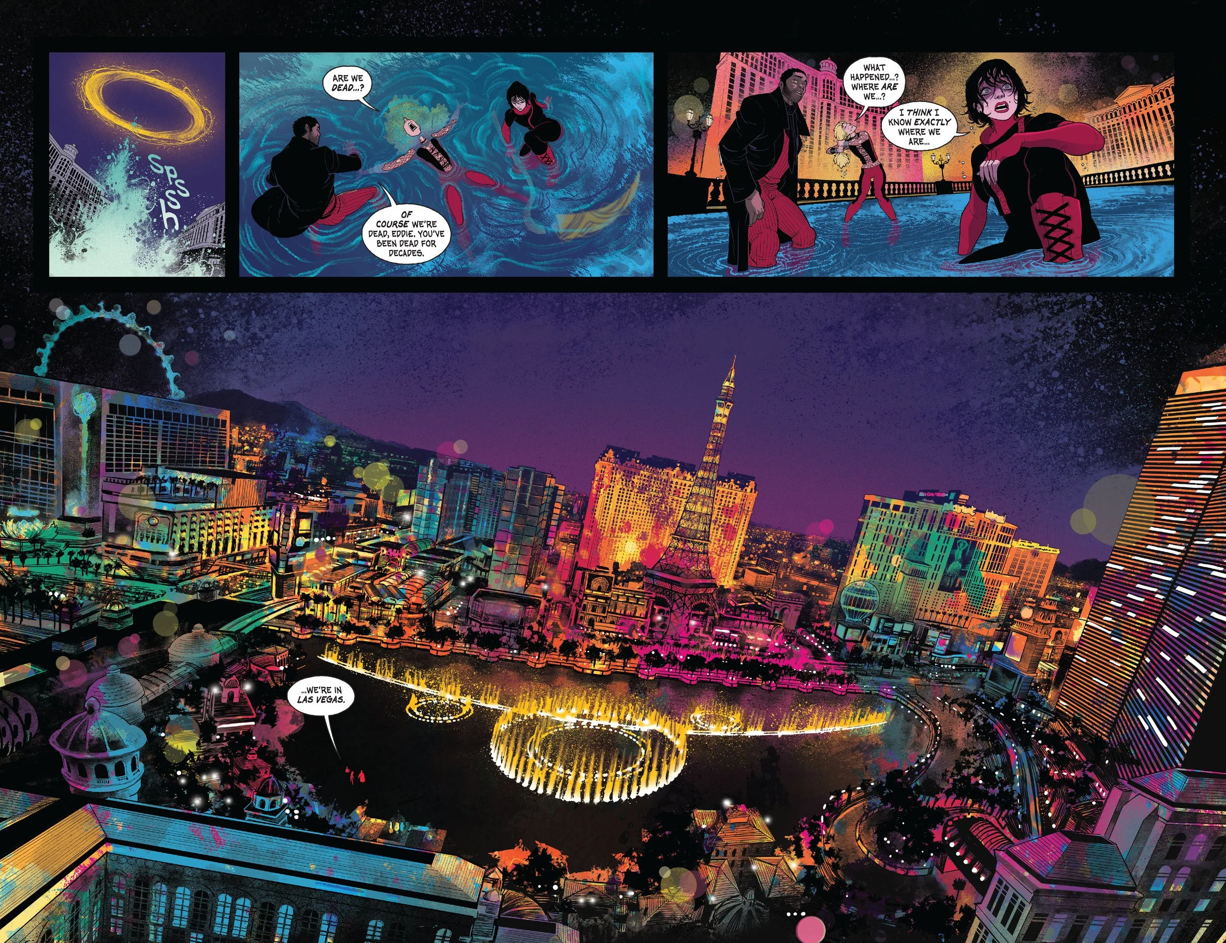
With something like the Las Vegas spread, you spend a lot of time on it, but in a way you’re almost on autopilot - drawing buildings, windows, cityscapes. When you’re working on an emotional scene like a girl meeting her father for the first time, someone she has never seen before, you have to stop for a moment and really think about it. You ask yourself what the best way is to stage that moment, how to convey the emotion properly. It requires a different kind of attention and sensitivity.
There’s also the penultimate issue - and this time I can’t really point to a single scene, because it’s the entire issue. Not the last one, but the penultimate. That issue is, in many ways, what you could consider the real ending of the series.
We didn’t want to reach the final page and suddenly reveal everything at the very last second. Instead, we chose to tell the ending calmly, giving it the space it needed. The penultimate issue carries that weight - it’s where the story truly resolves. The final issue, instead, takes a step back. It relaxes a bit after the ending and gives you something extra, almost like an epilogue or an afterword. It lets the story close gently, taking its time, and I think it works beautifully.
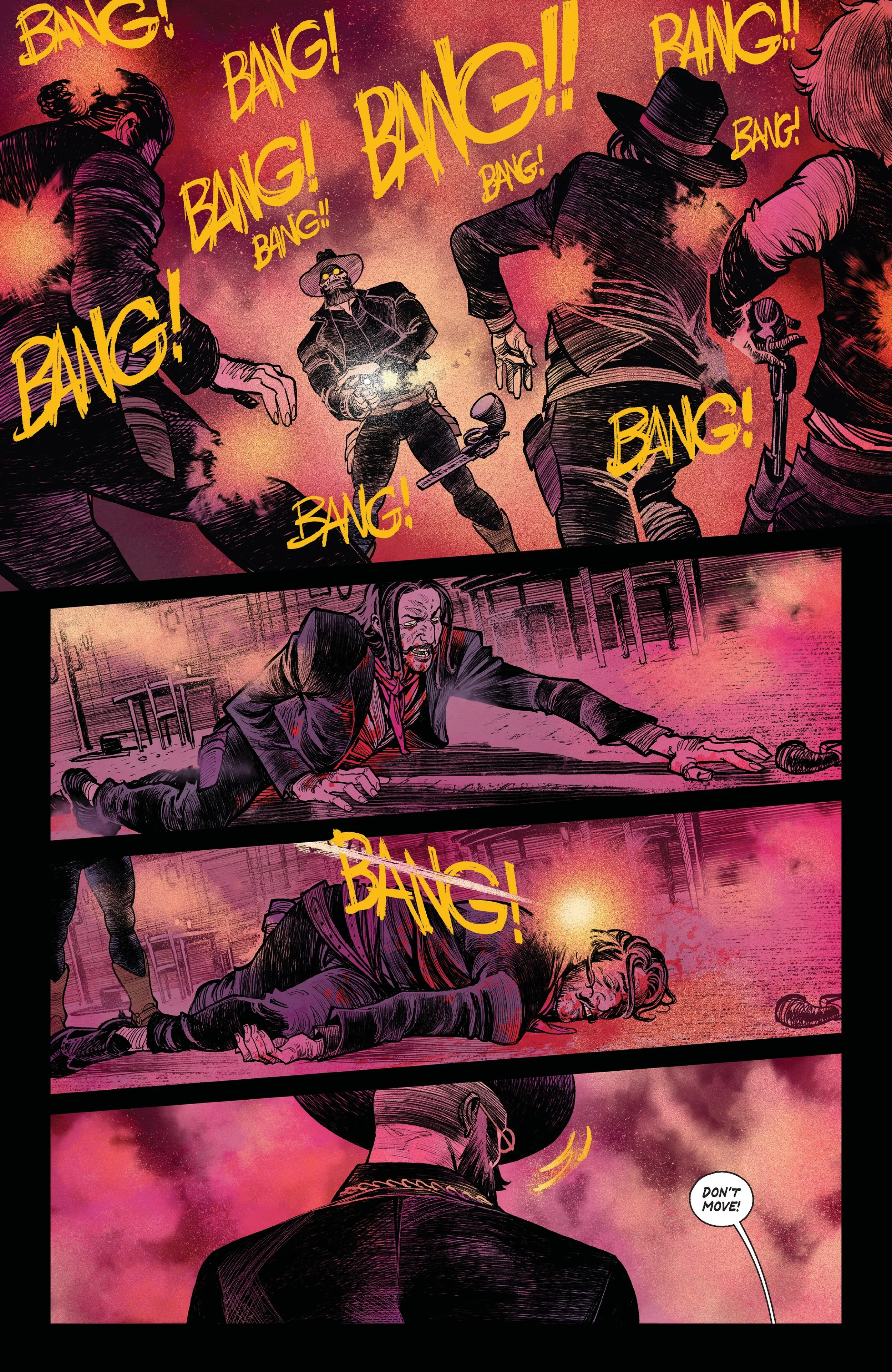
And then there’s a fourth moment. Or rather, a fourth issue. Not a single scene, but almost the entire issue. There’s an issue that’s almost entirely set in the Old West. Drawing that issue was an absolute joy for me.
I had so much fun working on it. When I first started making comics, I collaborated with Sergio Bonelli Editore: after my degree I worked on a couple of Dylan Dog stories. And growing up, I didn’t just read Dylan Dog - I also read Tex. I studied artists like Giovanni Ticci, Andrea Venturi, and so many of the classic Tex illustrators. I used to copy their drawings, the horses, the hats, all of it.
So finally getting the chance to draw a full western comic - that was incredibly satisfying. It felt like coming full circle.
Grim as a comic may have come to an end, but Netflix announced that an animated adaption is in the works. How are you feeling about this, knowing that the story you’ve drawn these past three years is going to be on Netflix?
I’m very happy that Grim has attracted the attention of such important producers. It feels like a wonderful reward for all the work our team put into the project, for the care given to every detail of the story, and for the effort we made to shape characters in a way that stays with readers long after they’ve finished the comic.
* * *
I’d like to thank Flaviano for taking the time to share his experiences and his special moments working on Grim with me. On the behalf of Pages and Panels, I’d also like to wish him all the best for his future projects.
Keep the flame burning!
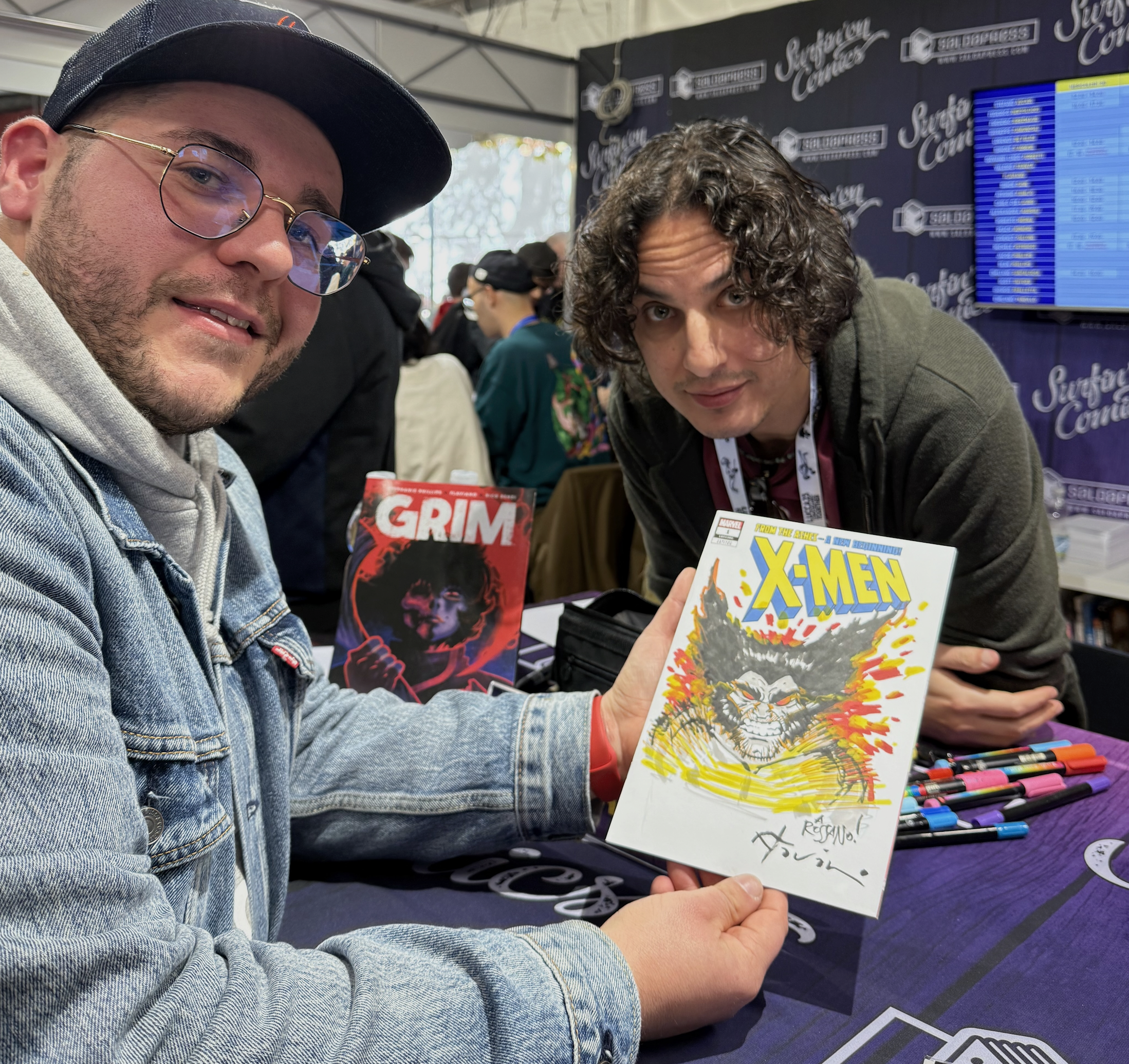
Pages and Panels Contributor, Rossano D’Angelo with Flaviano Armentaro at 2024 Lucca Comics & Games